
Whether you’re in the business of commercial or residential building, signage is one of the most important elements of your overall design. The right signage is an essential part of hitting so many of your goals as a builder, including bringing attention to new properties, filling a new community, or driving foot traffic into a new location.
We’ve already covered the elements of a great sign in a previous blog post , but just to review, great signs:
- Match the style and feel of your community or property
- Are strategically located for maximum impact
- Make effective use of design elements such as font, color and contrast
- Feel congruent to other buildings and signage in the immediate area
- Can be easily read from a distance
- Use proportion and scale effectively
- Make a visual impact on passerbys
- Are unique and on-brand for your community or property
It’s one thing to read the elements of a great sign; it’s another to see them in action. Here are five examples of great signage we’ve designed here at Marketshare that have helped our clients hit their goals, increase their reach and make a visual statement on their properties:
Sign #1
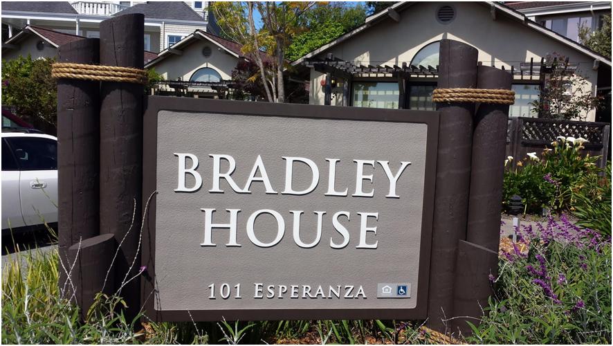
Sign Type: Identification Sign
The Bradley House community is an apartment community near the coast of the San Francisco Bay. The nautical theme of the sign design is the perfect thematic match for the complex’s proximity to the bay; the round, dark stained posts held together by nautical rope have a distinct seaside feel that mirrors that of the community. The color of the sign also matches the paint on the community buildings, creating a cohesive experience for visitors and potential rentals or buyers.
Sign #2
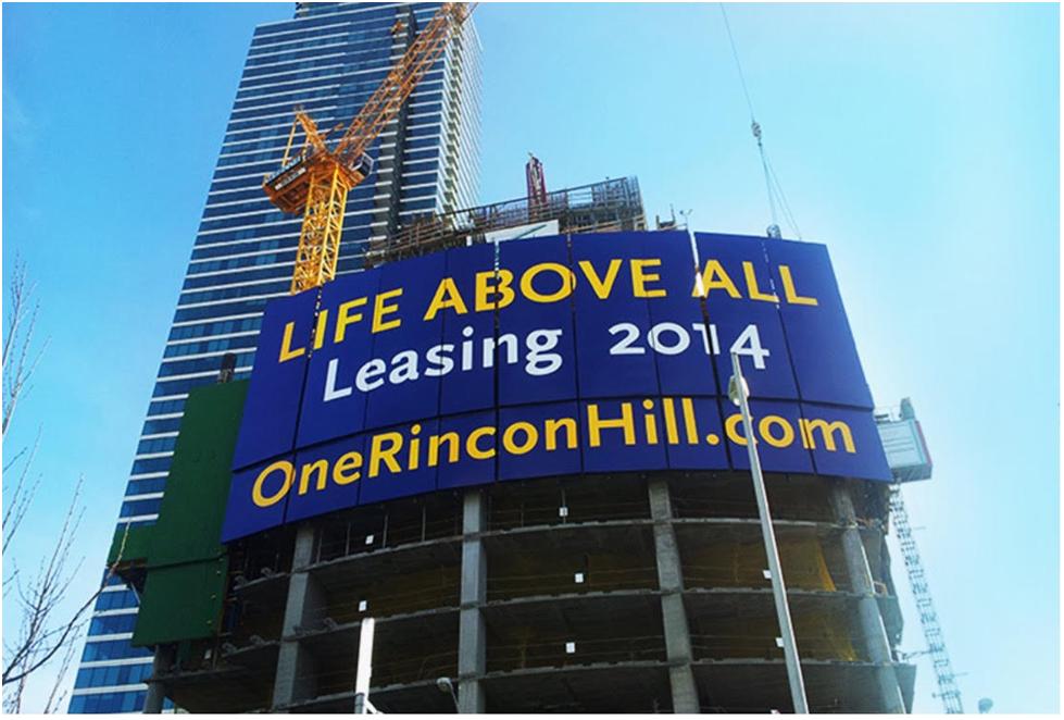
Sign Type: Billboard
One Rincon Hill is luxury highrise in San Francisco. During construction, they needed a sign to generate buzz within the community and start pre-leasing units within the building. This sign, which included the property’s slogan, leasing date and website URL, was 48’ tall by 101’ wide. Because the sign was so large and able to be viewed from long distances, we opted to keep the message and design simple, using contrasting colors to make the copy pop. The sign was comprised of 9 individual panels (each weighing in excess of 3000lbs) that were attached to a hydraulic system. As construction of each floor of the building was completed, the hydraulics lifted each panel to a new floor, eventually reaching 80 stories. As a result of this straightforward but effective sign design, One Rincon Hill was able to pre-qualify more interested residents than they had units.
Sign #3
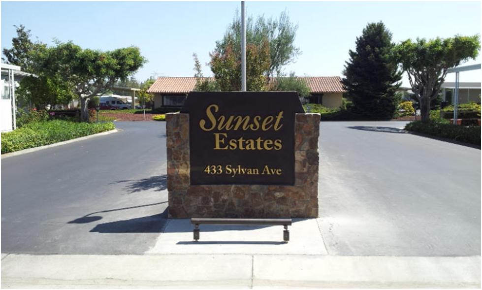
Sign Type: Community Sign
Sunset Estates is a community in Mountain View, CA that needed a more effective and impactful community sign; their original sign was set perpendicular to the street and was too far back to effectively draw in potential residents or visitors; because it was so hard to see, people were having a hard time actually locating the community. We changed the location to be more visible, used custom stonework and gold metal lettering to create dimensions and added a strip light bar to ensure the sign would be easily seen and read no matter what time of night. The increased visibility and readability has made the community sign significantly more effective for Sunset Estates.
Sign #4
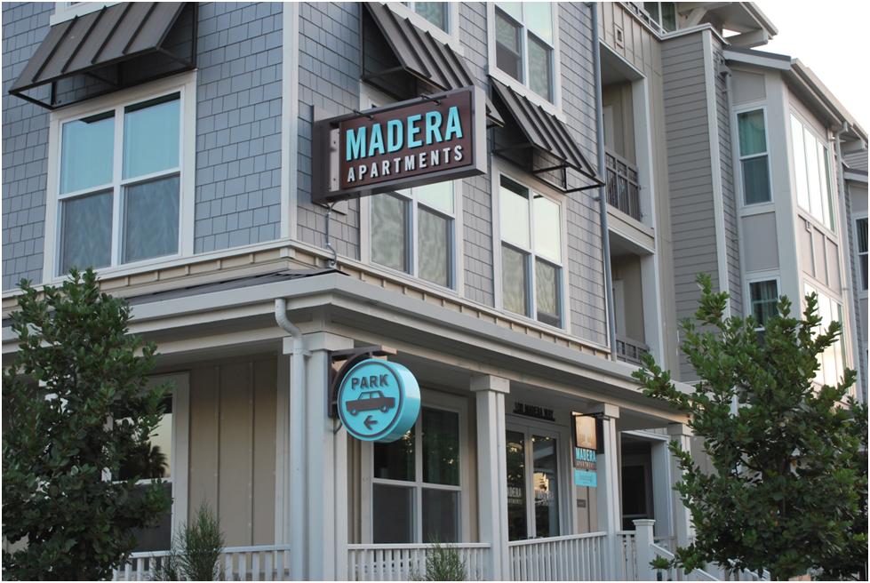
Sign Type: Multiple
Madera Apartments needed signage that matched the modern, contemporary feel of their apartment complex. This sign package, which included a corner bracket sign advertising the community name, a parking sign and a sign for the leasing office, leverage contemporary fonts and graphics. The teal, brown and white color palette allows each element of the sign to pop and ties in well with the modern bronze awning. This sign package is a great example of creating a design that fits the look and theme of the community, which will help to draw in the complex’s target demographic.
Sign #5
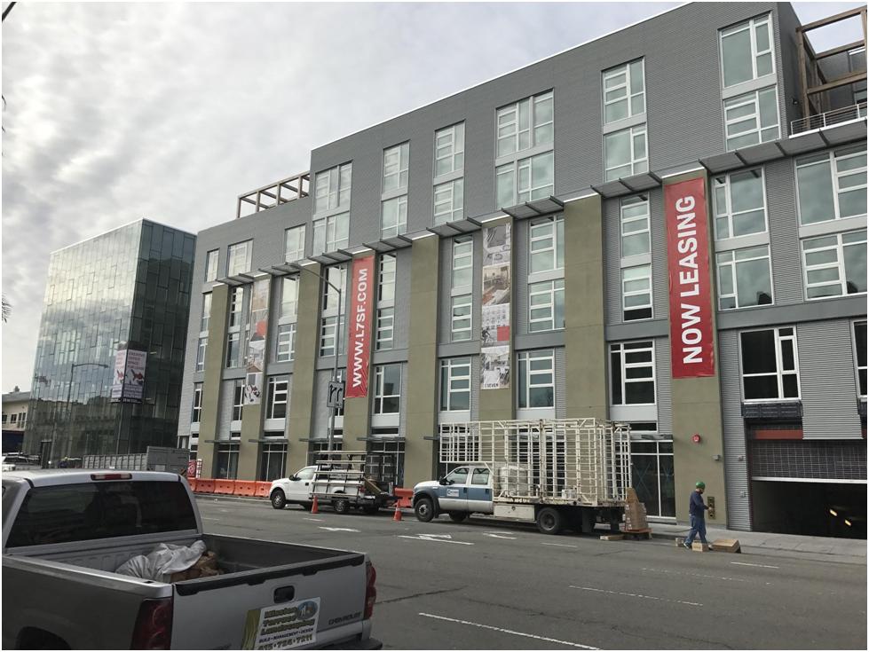
Sign Type: Advertisement
Leave A Comment